

Once again we would like to thank all of you who participated to the survey (find it here). In the weeks that have passed since we published the results, we have read many comments and questions in various forums which we would like to address with this blog post.
This post comments on questions like:
- What was the role of the partners?
- Why did we say “typical” and not “average” user?
- Was the survey representative?
- Was there any selection bias?
- Was the Survey Too Long?
What was the role of the partners?
Previous years we sent the survey link only to email addresses in the Navigraph user database. However, this year we asked developers, companies, and organizations to help us distribute the link also to their users. Some partners sent out a newsletter, some posted in social media, and others mentioned the link in their forums. In return for distributing the link, we presented the survey results to the partners in two ways - one which summarized all respondents, and one which summarized only those respondents who answered that they are using a particular developer’s or company’s software, or is a member of a particular organization. We refer to the latter group of respondents as the partner’s user group. The benefit of such an analysis is that the partners can see how their user group differs from the total group of respondents.It is possible for a respondent to be member of multiple user groups, for example if the respondent uses several different software. It was the responses in the survey which defined membership of a user group, not the argument at the end of the survey URL. The URL argument was only used to monitor traffic from links distributed by partners and allowed us to produce diagrams like the one below illustrating how well partner links performed.
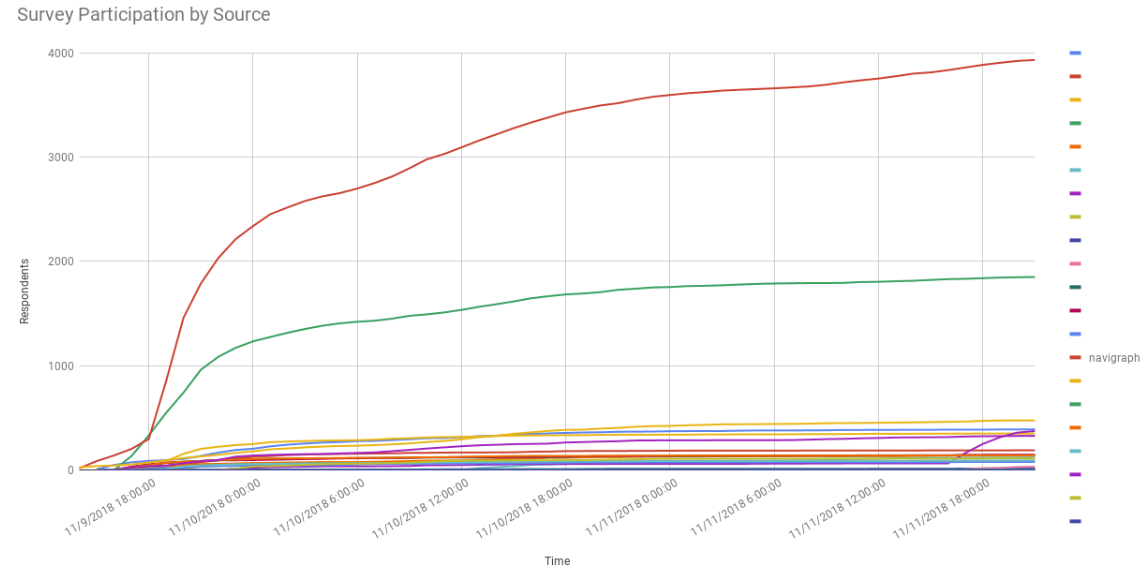
In the diagram above it is clear to see that most respondents were recruited via the link which Navigraph published. However, there are several smaller contributions from other partners.
In some places on the Internet, our survey partners are referred to as “sponsors”. This expression is not accurate as there was no exchange between Navigraph and partners other than what is described above.
Why did we say “typical” and not “average” user?
When respondents were asked about their age they filled in a number. The numerical answers distributed themselves over a range from about 15 to 85 years. Some partners had and age distribution skewed towards a younger age group and other partners had even distributions across almost all ages. To calculate the central tendency of such a distribution one can use the mean, but if the data contains outliers those values can bias the mean. Therefore we tend to also considered the median. Another aspect is the large variance. The age distribution did not have much of a central tendency. When we wrote the press statement we visually estimated the central tendency of the distributions which is why we chose the word “typical”.Was the survey representative?
For practical reasons we cannot exhaustively ask every flight simulator enthusiast in the world about their preferences and opinions. Instead we have to settle for a smaller group and hope that these answers are representative for the rest of the enthusiasts. In stats lingo we say that we use a sample to make estimates about the population. Since we don’t know how many enthusiasts there are, our estimates can only be expressed in percentages. If 20% of the sample think airliners are cool to fly, then 20% of the total population probably thinks so too. This is under the assumption that we did not accidentally ask too many airline pilots compared to general aviation pilots. Selection bias is covered in the next section.Did we reach sufficiently many respondents to correctly sample the population? We don’t know. We don’t know what the distributions should look like. However, when we bin the answers into histograms all of them are continuous.
In short, while we cannot draw any statistically significant conclusions from the survey (since the questions were not designed for such tests) the distributions can be used as guides.
From a practical point of view, we did the best we could. In fact, no one had done it better before us. This is the survey with the most respondents to date. It’s also the only one distributed by multiple partners. Next year we hope it will be even bigger and that will allow us to compare and make judgments about trends and weather previous samples were reasonable.
Was there any selection bias?
Selection bias occurs when the choice of respondents is not completely randomized. The randomness should ideally be present in all properties of the respondents: gender, age, location, preferences, etc. Since complete randomness in all properties cannot be achieved one could say that selection bias is a relative expression - the survey data may be good for certain types of analysis, but biased when it comes to answering other types of questions.As an example, there was a suspicion that the survey link had been distributed predominantly among X-Plane users which could have resulted in fewer respondents selecting P3D as their preferred simulation platform. The source diagram above shows that there was no significant contribution from any source linked particularly to X-Plane users. The red line is Navigraph. The green line below is not from any X-Plane related source.
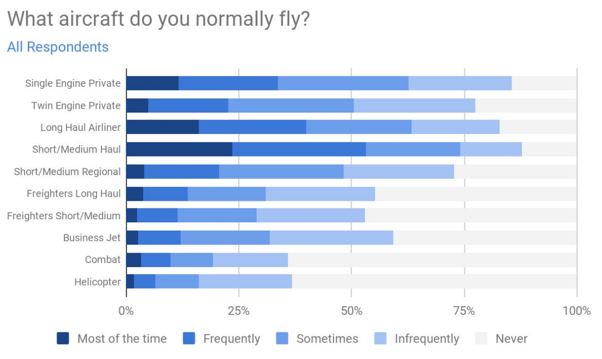
There was also a concern that since respondents were sourced from Navigraph and from Navigraph partners the survey could have a selection bias towards respondents with a preference for airliners as aircraft type since it was the belief that Navigraph and its partners predominantly produce software for this type of aircraft. However, the diagram in section 2.4.6 does not show an apparent difference between Single Engine Aircraft over Airliners.
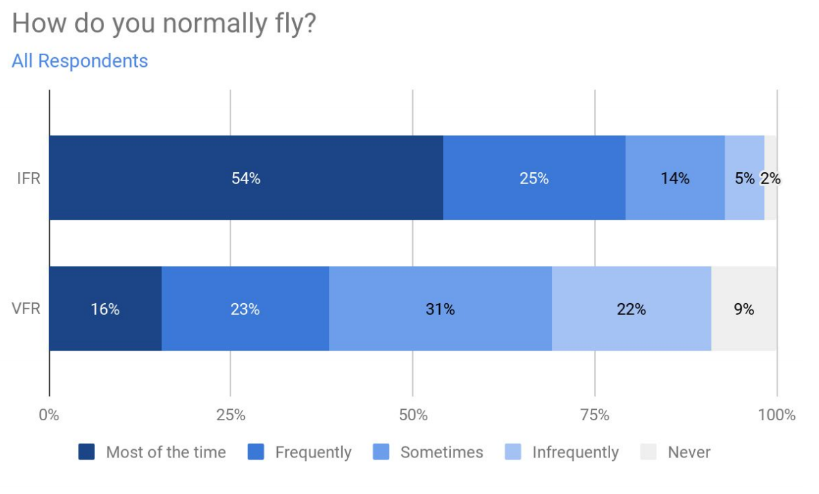
Section 2.4.7 regarding flight rules does, however, show a preference of IFR over VFR.
By adding more partners to the survey project respondents will be sourced from more diverse contexts which will reduce selection bias. We welcome more and diverse partners for next year. We are also considering translating the survey. However, we want to stress the importance of all partners contributing and doing their very best to distribute the survey link - it is in their interest to get as many respondents as possible from as many diverse user groups as possible.
We also wish to stress that the invitation to become a survey partner was sent to many developers, companies and organizations. However, far from everyone responded or chose to participate. The reason why some of the prominent actors in the flight simulator community are not a part of the survey may be because they chose not to participate this year.
Was the Survey Too Long?
The survey consisted of 77 questions. While we wanted to cover many aspects of flight simulation, we too can agree that 77 questions is a very long survey. That said, the questions were presented conditionally depending on previous answers, so not all respondents were asked to answer all questions. In any case, next year we will aim to shorten the survey. We will be able to take some questions out which need not to be asked every year. We also hope that next year’s partners will be able to suggest questions to illuminate new trends that are interesting to follow.Partnering for 2019
If you, your developer group, or your company would like to become a partner for next year’s survey, please write us at info@navigraph.com with the subject line “Partner Request for Navigraph FlightSim Community Survey 2019”.