Published Sep 10, 2021
Dynamic and Interactive Enroute Charts
charts
enroute charts
news
preview


Enroute charts in printed form are big and unruly; covers the entire working surface of your average desk; flaps around the cockpit and won’t fold back to its original pocket size. By its size factor alone we can all agree that enroute charts are much more manageable in a digital form. In Navigraph Charts, you can easily zoom in and out of an area of interest using the pinch zoom gesture on tablets and the scroll wheel on a mouse. That’s fine, but in the next version of Charts we are taking digital enroute charts a few steps further in terms of usability and legibility.
So far the enroute charts in Navigraph Charts have been static. That is now going to change and we will make the enroute charts not only dynamic but also interactive. What do we mean by that? Read on and we’ll explain.
Dynamic Enroute Charts A paper version of an enroute chart, and any scanned or vectorized copy of such a chart, is considered static in the sense that all of the information contained in the chart must be displayed at once. This is true for any paper chart, and results in interpretations which perhaps is the reason why cartography is sometimes considered an art. Even with creative solutions for visualizing the mapped reality, many charts have busy regions which are cluttered and hard to read. Anyone who have tried searching for a particular waypoint name, or trace a route, on a paper enroute chart knows this. Add to this that enroute charts are very seldom oriented such that up points north, which makes you tilt your head, making it even harder so see and straining on the neck. The enroute charts in Navigraph’s previous version of Charts were static, vectorized copies of enroute charts, but they will be no more.
In the new version of Navigraph Charts, enroute charts are dynamic, meaning that you can zoom in and out of an area of interest, and information will appear (and disappear) as needed. The process of intelligently distributing information in a legible way, so called “label placement”, now ensures that all of the information is easy to read. In a way, the enroute charts in Navigraph Charts now behave in a way similar to Google Maps, or nav system in cars, which we all have come to know and get used to.
The symbology presented in the following screen captures is tentative. We know that some of you are going to freak out and have all sorts of opinions about what’s proper symbology. We are already planning a separate blog post about how we have reasoned around this. That said, this is in no way set in stone and we do encourage you to tell us what you think, and why you think that way. Send us your thoughts via dev@navigraph.com, or post on Facebook, or in our forum. Obviously we favor objective input over subjective feelings and habits since, well, we’re engineers and we cannot relate to these “feelings” you speak of, except for maybe hunger. And thirst. Beer. Mostly. :) The final set of symbology, which we all eventually agree on, will be documented in a legend which, of course, will be available in close proximity to the charts. Lastly, we shall also stress that the illustrations below is “work in progress”. Be kind. But also constructive. Ok, wow, that’s enough disclaimers for one day. Let’s move on.
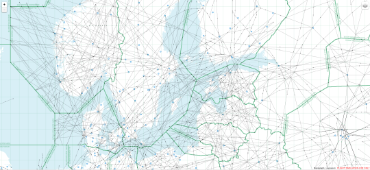
Figure 1: Looking for ESSA, Stockholm Arlanda, in Sweden. FIRs are denoted in green; and airports have a blue cogwheel icon.
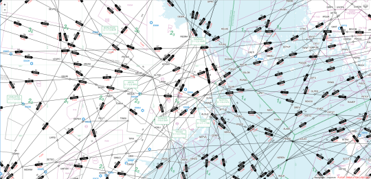
Figure 2: Zooming in on the Stockholm area. Now we are starting to see airway labels names, directions and flight levels; various fixes; the grey airspace polygons; and the purple restricted airspace. We can also see green frequency labels for the navaids.
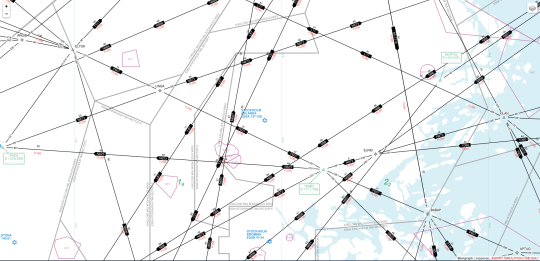
Figure 3: Airways are starting to separate as we zoom further in to ESSA. Now we can see airway bearings; green navaid triangles (with their frequency labels); plain waypoint triangles; and RNAV waypoints depicted as stars. Fixes that are compulsory reporting points are filled, where as non-compulsory points are hollow. Fixes on an airway have a small gap between the fix and the airway line, whereas fixes not on the airway have the line drawn all the way up to (and across) the icon (there are no examples of this in the screen capture above). The green numbers are Minimum Safe Altitude (MSA).
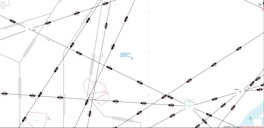
Figure 4: Final zoom level on ESSA. The airport name and serving city appears in blue text.
Intelligent Label Placement Adapted to Aeronautical Charts The logic behind label placement is quite intricate. Instead of developing all of this ourselves we will be relying on existing map server software to do this for us. That said, the label behavior still needs to be configured to suit the typical enroute use case, which differs from, say, streep map route instructions for car drivers, or navigating beacons in nautical applications.
Moving Maps In addition to changing appearance as a function of zoom level (scale), the concept of dynamic enroute charts also encompasses moving around on the map (translation). The new dynamic version of Navigraph Charts allows you to pan in any direction and seamlessly move around the surface of the globe without having to switch from one chart to another, as was the case with the previous version of Navigraph Charts. We will remove therefore remove index charts and let you select upper or lower airspace via a toggle in the corner.
Since your can now move freely in any direction, we can also let the application move the map for you. Do you see where this is going? Yes, moving maps will also be part of the future Navigraph Charts. However, this topic is so big that it will require a future blog post all on its own to be fully explained. In essence, however, the future version of Navigraph Charts will be able to plot your ownship position and move it on the enroute chart as your position changes in the simulator. Which simulators are supported? How does it move? How does it work? Those are all questions for another blog post.
Interactive Enroute Charts In the beginning of this blog post we mentioned the use case when one is searching for a waypoint. It’s a frustrating task and can take some considerable time, even if you know where the waypoint is located, like “GINIS” for example, which should lie right off the coast of Ireland, obviously, but still takes some time to find. If there only were a way to search… Well, there is.
Textual Search With the new version of Navigraph Charts you can textually search the enroute chart for waypoint names, navaid idents, airport codes, and so forth. Once you have entered a search string, you will see a list of objects which match that query. Once you click of the objects, the chart will pan and zoom to that area and highlight the object of interest.
Geographical Proximity Search Conversely, you can click an area of the enroute chart and do a proximity search of the objects in that area. Similarly, a list of objects will be returned for you to chose among. We call this geographical proximity search, or LL search (lat, lon), because we have organized all of the objects in the ARINC 424 source data into a POSTGIS database which allows us to quickly calculate distance, proximity, and intersection using so called spatial indices.
Route Visualization Many of you are using enroute charts to plan your routes. This is why we have decided to include a route visualization tool. Just copy a route string from your favorite route planning tool and paste it into Navigraph Charts and we will highlight that route directly on the enroute chart, provided that the route is valid. Our route validator quickly checks if the route passes known fixes. The route can also be saved in a form of advanced bookmarking function so that you can keep your library of routes right next to your maps.
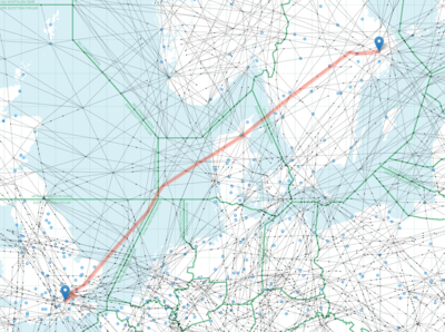
Figure 5: The result of entering “ESSA SID ARS N623 BEDLA N866 RAM N581 EVAKI N866 UPGAS UN866 TIPAN UM185 DIGSU UN866 BPK L10 LAM STAR EGLL”.
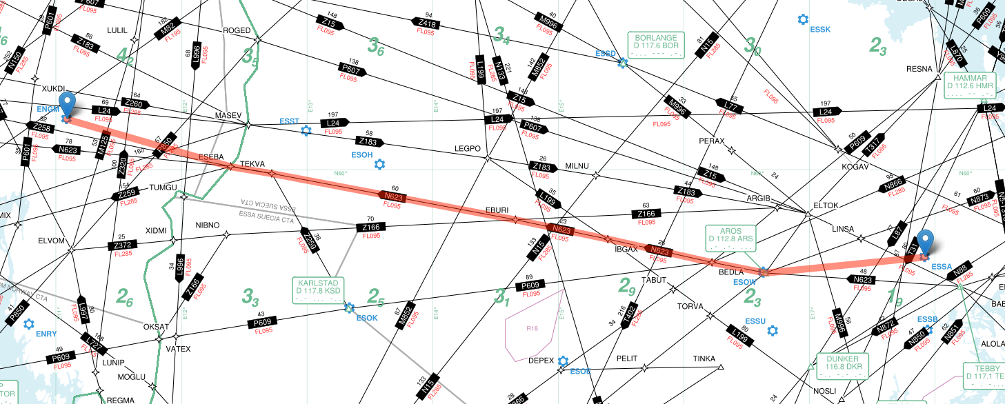
Figure 6: The result of entering “ESSA SID ARS N623 ESEBA STAR ENGM”.
We are quite enthusiastic about the route visualization feature, especially in combination with the moving maps function, since it opens up for many more interesting functions which might improve situational awareness and planning ahead: What’s coming up next? What do I need to prepare for?
This summarizes our work so far on the enroute part of the new Navigraph Charts product which will be available early 2017. With your input we can make this product even better. Feel free to get in touch and let us know how we can improve. In fact, let’s get as many eyes as possible on this. Share this post with anyone what might be interested.