

About two months ago, we announced the relaunch of the entire Charts product line. We are very excited about this and would like to show you the fruit of our labor right now, immediately, but developing these things take time. The work, the discussions, and the exchange of ideas leading up to this product launch have been going on for more than a year. In this post, we hope to give you an insight into the creative process of the new Charts product. By looking at the early sketches and reading between the lines you might be able to catch a glimpse of what the Charts product eventually will look like. To be completely clear, neither of us knows exactly what the final product will look like. The last line of code has not been written yet. For this reason, all of the pictures seen in this post should be regarded as work in progress.
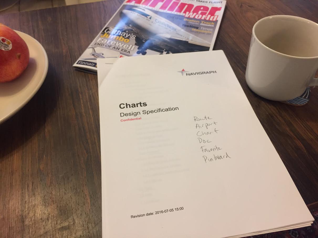
Scattered thoughts and wild ideas were at first summarized in this early design specification. This document was in fact found just moments ago deep down in one of the paper stacks on a developer’s desk here at the office. This particular revision is dated July 5th 2016. Most of the ideas in this document have now been turned into code.
The Charts Product
For those of you who are not familiar with the Navigraph Chart product, let’s briefly say something about its background and history. It all started in October 2004 when nDAC 1.0 was launched. The abbreviation stood for Navigraph Digital Aeronautical Charts. It is still a bit unclear why someone, anyone, thought this was a good acronym - half of the time it got confused with Microsoft Data Access Components (MDAC) and the rest of the time people just referred to it as “Navigraph Charts” anyways. In those early days, revisions were sent out on CD-ROMs (with regional coverage), and later DVDs (containing worldwide coverage), via postal service, a.k.a. snail mail. This update procedure was far from reliable, so as greater Internet bandwidth became available we incorporated a download manager into the Charts software. In 2006 we printed and shipped our last plastic disc.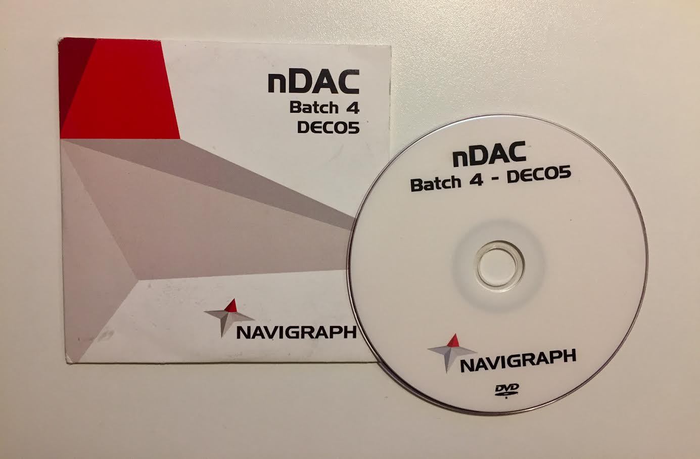
During the following years, the Charts software, still called nDAC, was updated with a few major versions to incorporate enroute charts and video viewing capabilities. We changed data providers from Navtech for Lufthansa Systems, and did some minor improvements to interaction and printing, but other than that, the product has remained largely the same over the years. Since this is a developer blog, and since we are all huddling up here around the camp fire sharing stories, it feels like a good moment to reveal a few closely guarded secrets. To start with, did you know that Charts has had the same Visual Basic code base since the beginning? Of course you didn’t. A bit like a rusty but trusty old tractor our Charts software has been running all these years. That’s good because there is in fact only one developer who knows how the code ties together. This is remarkable in many ways, especially since large portions of the code was written late at night after a few beers. The intricate chart revision control was actually completed in a motel room in France after a night out. As impressive(?) as this highly agile development methodology might be, it was a while ago since we last prided ourselves with being able to develop under the influence and a new Charts software is now long overdue.
While we were still pondering on what the feature set of the new Charts product should contain, we launched Charts Cloud in 2013, the first iPad version in 2015, and followed with an Android app in 2016. Developing apps have made us become more serious about setting up good APIs, which in turn have lead up to the strategically important point at which we are today, where we can provide the same functionality across multiple platforms. A common API for all platforms saves us a lot of work on the serverside, but in return emphasis is put on the user interface programming for the upcoming clients on Windows desktop, Mac desktop, Android, iOS and finally, the browser based viewer.
Similar but Different When reasoning around the interface design we assumed that users will have one preferred platform, but maybe ocassionally use one additional device. We think that it is important that the design is similar between platforms, if nothing else for aesthetic reasons, but mainly so that a user finds his way on one platform knowing the other. That said, there are technical aspects which differ one platform from the other. A desktop client typically has much more horizontal screen space. Having this screen space to display a menu like an accordion, instead of drilling down, will save mouse clicks and speed up navigation. On a tablet, however, we might save this space to provide sufficent interaction area around buttons to fit finger gestures.
We decided to start sketching on the app design first, if nothing else to get a wireframe that describes the navigational structure.
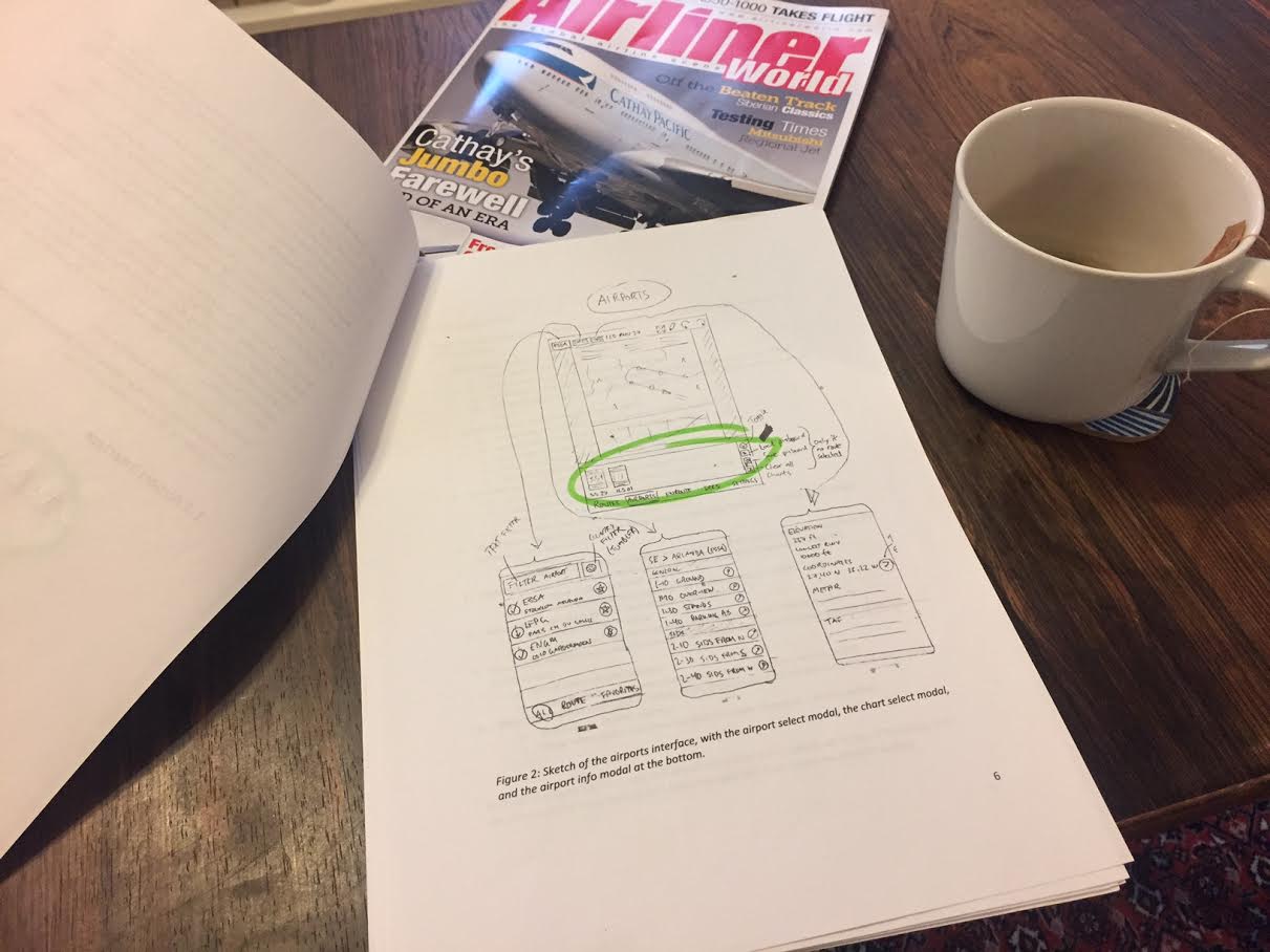
As seen in the sketch above, we initally thought that the apps should have modal windows for selection of airports and charts. We also wanted to put more emphasis on text filtering to quickly find the airports and charts you were looking for. At this stage, we decided to let the ICAO code play a more significant role than in previous Charts software. We assume that this is a common and natural way for a user to interact with the app. Moreover, the area circled in green is the “pinboard”. It is a navigational feature which will replace the “clips” feature in our current Charts software. We are hoping that it will be so versatile that we won’t even need the tabbed interface which some of you have been suggesting.
The idea of emphasizing text input for filtering was also tested outside of airport and chart menus. In the sketches below, in particular in the top middle rectangle, you can see a search window which we almost immediately dubbed the “super search” because it can search anything everywhere.
We later abandoned the hard emphasis on modals, and put a lot of the the navigation to the sides of the interaction surface. This also enabled us to discuss usecases where one would either browse for some airport, or have a more structured purpose with the intention of setting up a_route_ consisting of a departure airport, an arrival airport and any number of alternate airports. This meant that the concept of a route developed into something similar to an advanced form of bookmark.
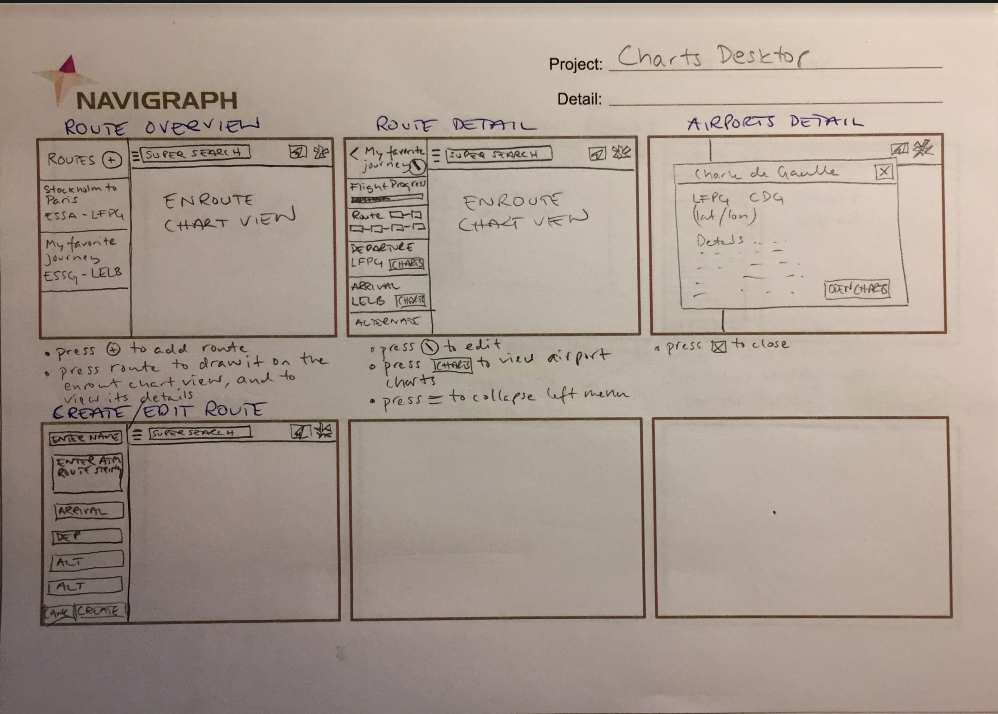
So, how does one define a route in the fastest way possible? Probably by using an ATC route string like this one “ESSA SID DKR N872 ELPAX Z703 KESUR UZ703LERVO UY131 MOPIL STAR LFPG”. These waypoints are in turn visualized as “pearls on a string” which is seen here in the “route detail” sketch in the top middle rectangle. In fact, the route will also be drawn on the dynamic and interactive enroute charts which will be incorporated into every Charts client.
From Lo to Hi-Fi Sketches
There are a few shortcomings with pencil and paper. While they are extremely flexible, I find that its hard to draw true to scale (I always draw too big) and more often than not my team members have to ask what it is that I actually drew. At this point it’s good to move from low fidelity sketches to something made with a graphics editor.Here’s an early sketch on what the iPad app could look like. The route and browsing scenarios are represented using tabs in the lower left corner. We have put some information in a modal. Remember that this is a mockup and only an artist’s representation. (For all of you Sherlock Holmes out there, let it be known that the chart in the background is just an arbitrary placeholder.) In this particular sketch we also started playing with flight progress.
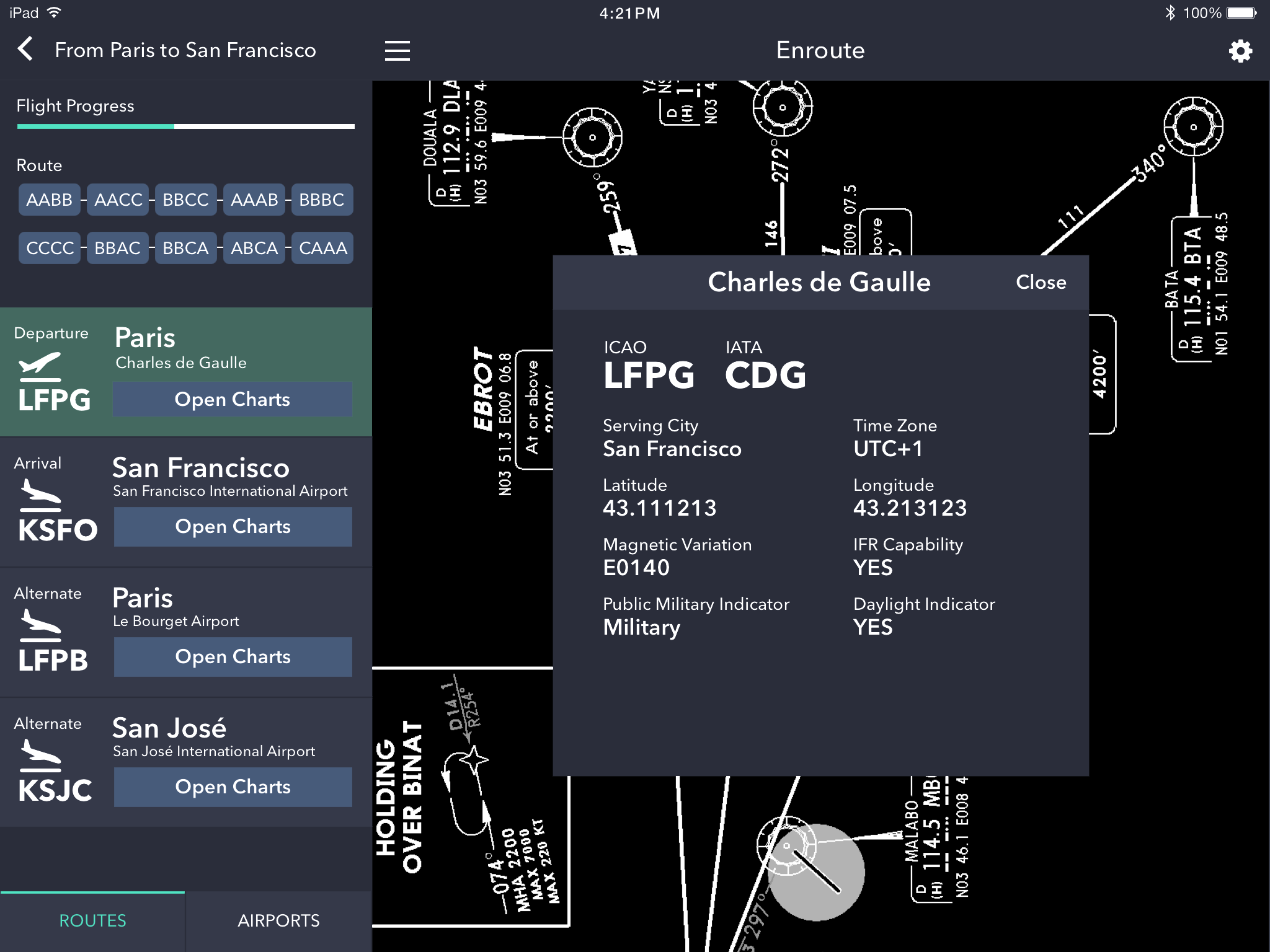
Early in the design process, we visualized opening an actual airport something like this. We want to preserve the color coding of the charts because this is a nice feature helping you to quickly find the type of chart you are looking for. At this point, we haven’t added any quick filtering buttons which is a nice feature from previous Charts software which we also want to keep.
On an Android device, a route might look something like this. Note how the pencil denotes an edit mode which is typical for Android interfaces. We received some feedback on our previous Android app that is looked too much like an iOS app. We are hoping to change that.
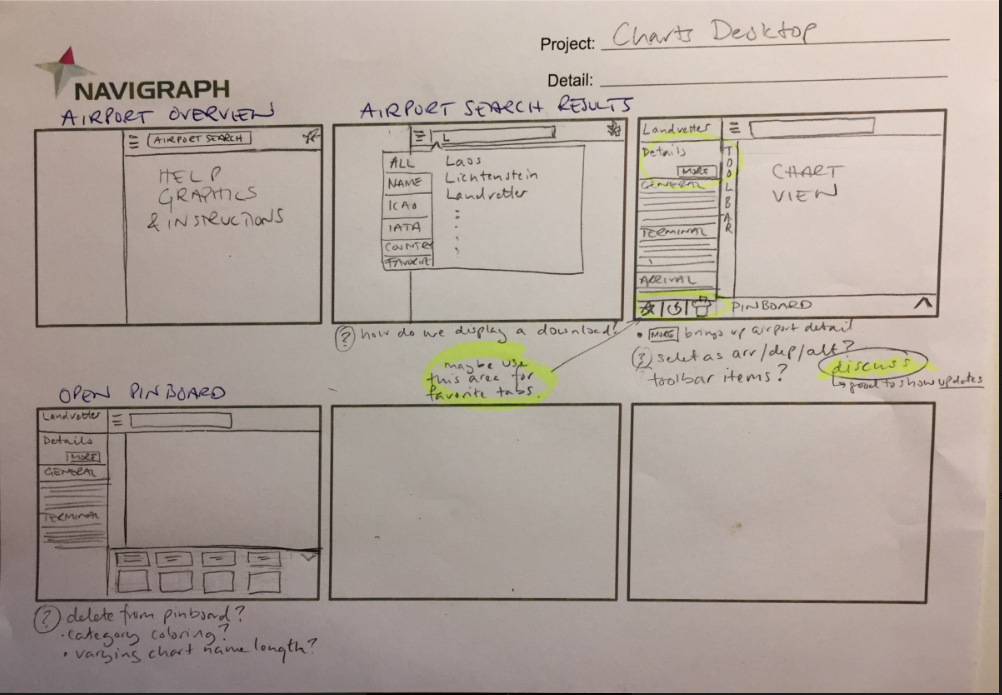
Moving from App to Desktop We have to develop code which works both on Mac as well as and Windows desktop. Therefore, we started experimenting with Qt. Would it be fast enough to list all of our airports? This is the first sample.
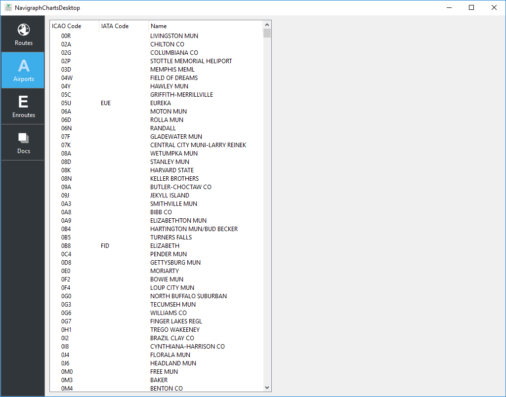
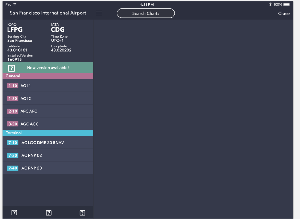
For performance reasons we couldn’t keep the default list, but had to build something ourselves. Besides, we needed some special icons to denote download and update status of an airport. Furthermore, we decided to explore what it would look like to open the menu to work with some of that unused horisontal space on the computer screen. As you can see, the color coding of the charts has now been established. As promised, we are also putting more emphasis on the ICAO code. The quick filtering buttons are also present.
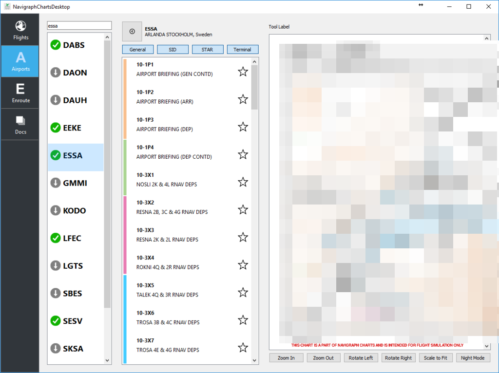
Those of you with eagle eyes also spot the “night mode” button in the lower right corner. This will be the topic of an separate blog post in the future.
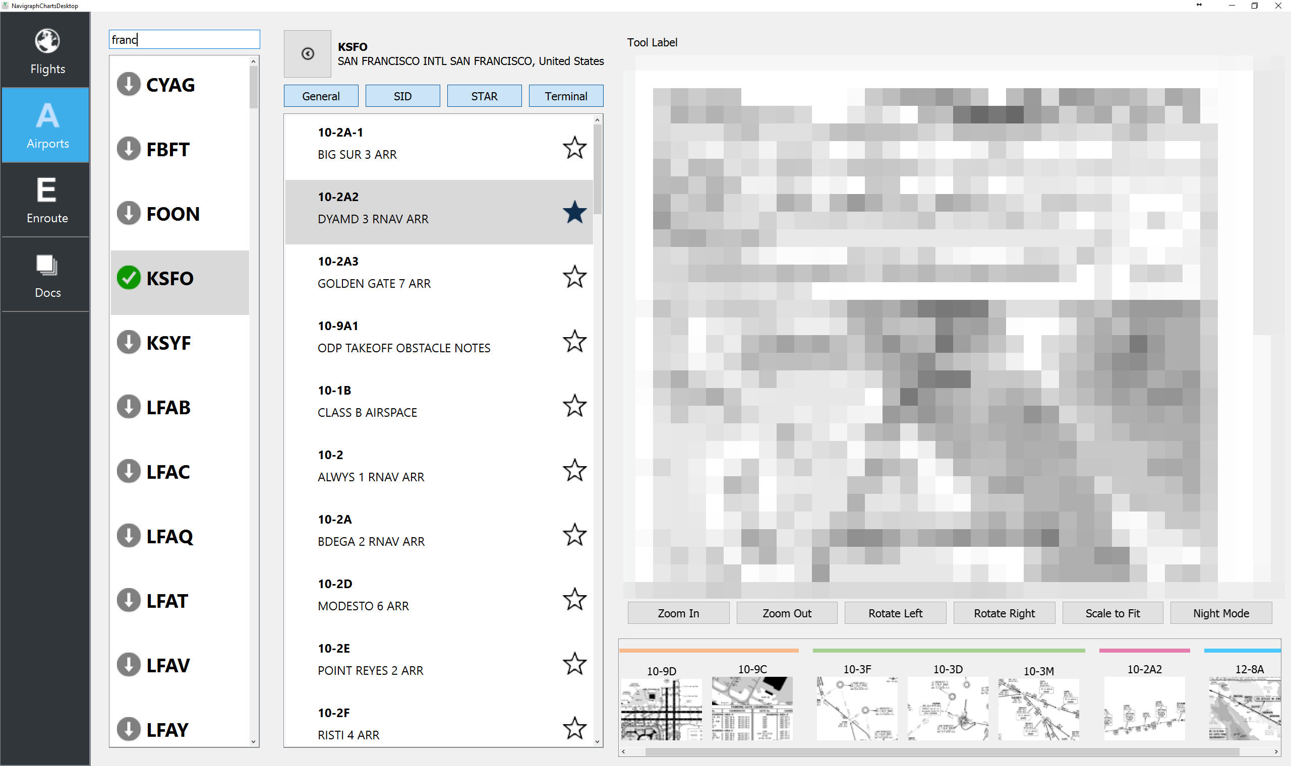
In the prototype above we are experimenting with a pinboard at the bottom of the main chart viewport. Charts that have been selected with a star (this icon will probably be replaced with something more resembling a pin) will be put in the pinboard for easy access. They are also ordered according to what type of chart it is, as defined by the color coding. Each pinboard is specific to an airport.
Enroute Charts in All Clients
Last but not least, we can show you some previews of the enroute chart. It can be loaded in any client, and has all the elements you would expect of an enroute chart. The prototype below is illustrating a VORDME with a compass rose compensated for magnetic variance right by RJOM Matsuyama airport in Japan on an iPhone using a night mode color scheme.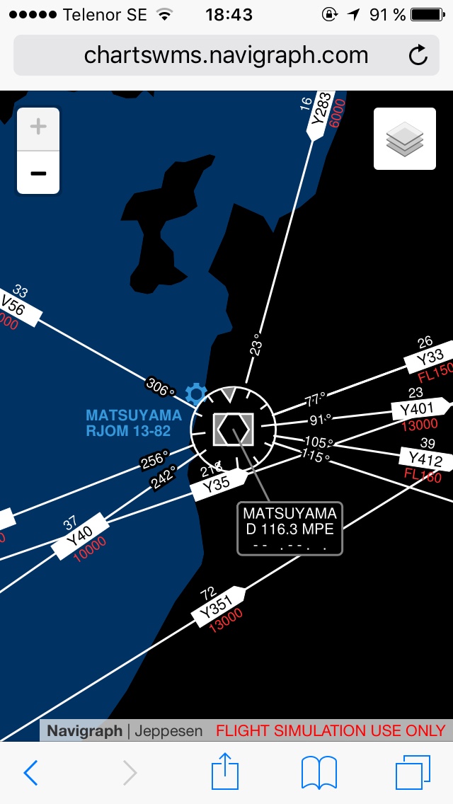
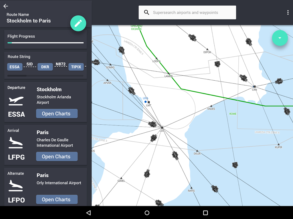
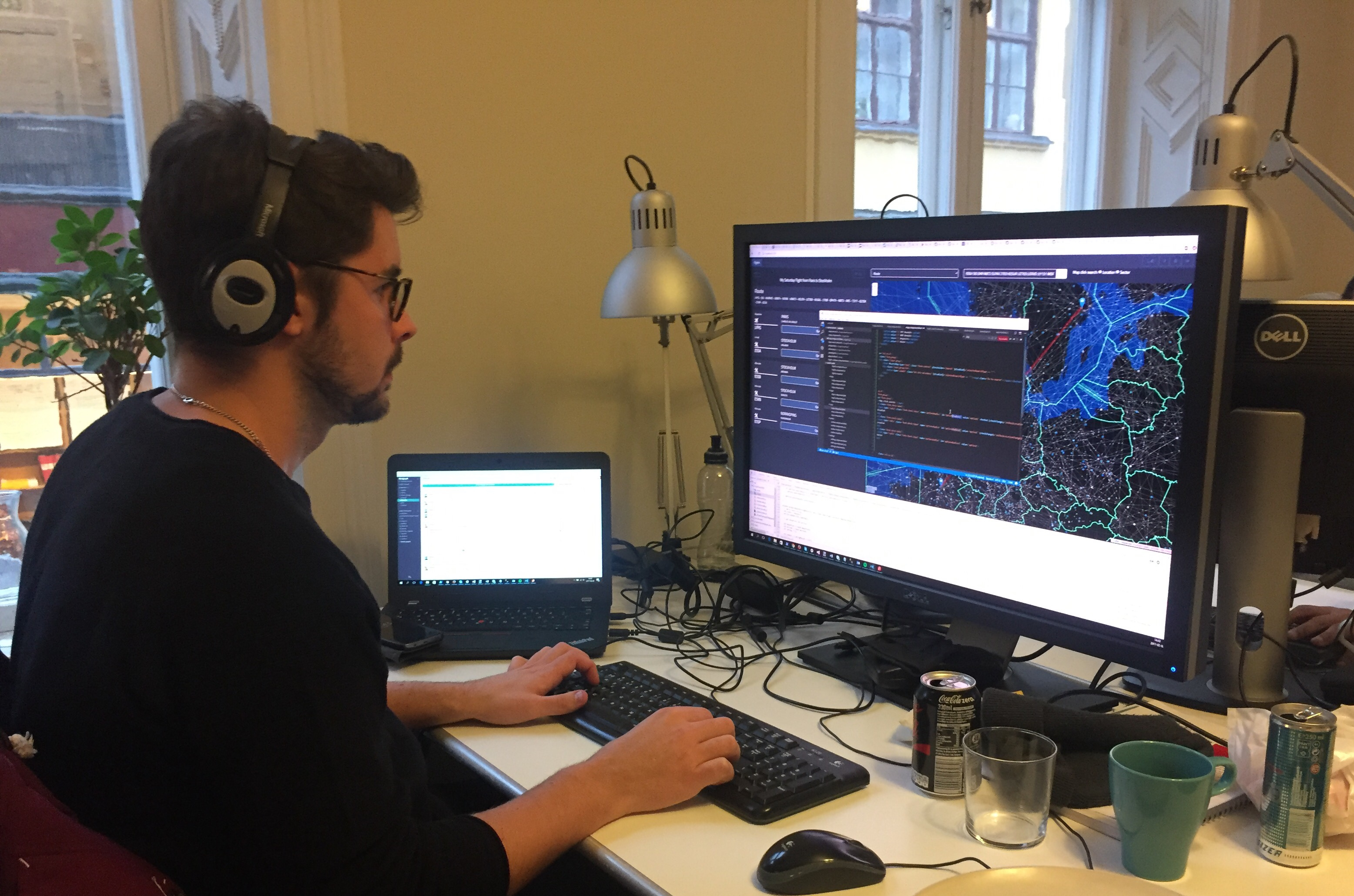
The enroute chart will also be available in the Charts Cloud interface. Although much of the interface is hidden by a code and debug window, you can see the green FIR outlines and a red route line from Stockholm to Paris. By now you are probably also familiar with the route menus to the left, although they are not quite finished yet in this photo.
Summary
As you can see, for every two steps forward with Charts there is one step back, comtemplating and deciding the best design options. We are simultanously working on five clients, not counting the video interface which has been extracted into a separate software, Navigraph Play. Sometimes it is a bit tricky to keep everything a part; and sometimes it’s easy because several interfaces are taking benefit from one single solution. There are many parts which we haven’t touched on in this blog post, mainly features that we are saving for future blog posts, moving maps for instance. However, regardless if there is something we have mentioned in this post or not, your comments and suggestions are always welcome. You may post them here below, or use our support forum if you like. We are quite quick to respond on Facebook and Twitter as well. Until next blog post - Blue skies to you all!